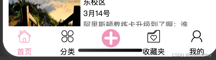
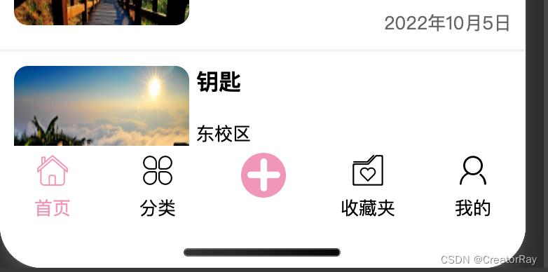
最近开始在写一个零基础从0写一个失物招领小程序的系列视频,涉及到了自定义tabBar,也就是底部导航栏的内容。看了下我的博客似乎之前没更新过,所以给大家写一篇。
首先我们先去看下官方文档:
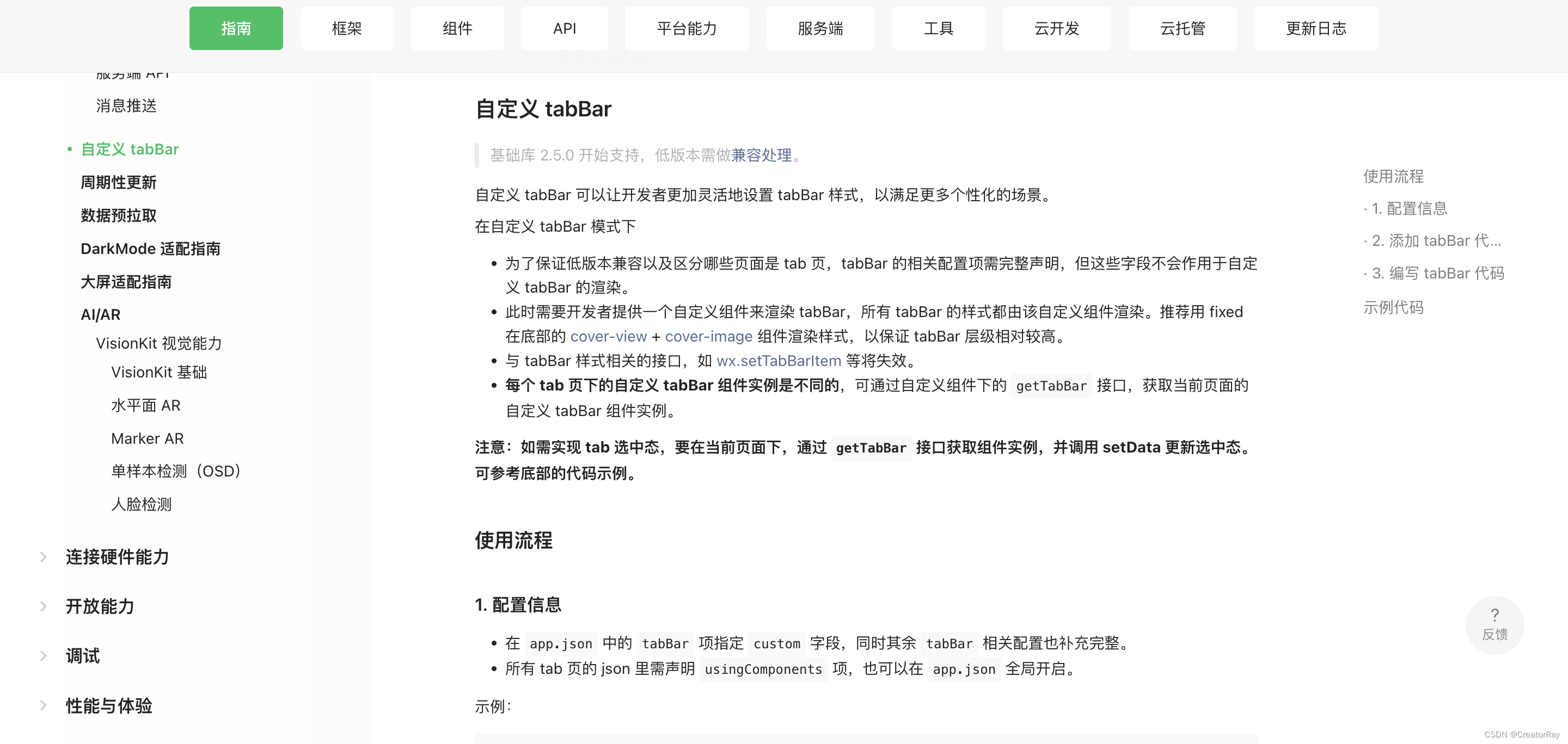
其实大致来说,可以总结为三点。
- 即便是自定义
tabBar,也需要去app.json里进行配置文件的声明,也就是iconPath、pagePath、selectedIconPath、text这些。 - 需要自己写一个组件,来渲染
tabBar。 - 在更新选中态的时候,需要借助
getTabBar来拿到tabBar实例
一步一步来。
配置tabBar
在app.json里
js">{
  "pages": [
    "pages/index/index",
    "pages/classify/classify",
    "pages/collection/collection",
    "pages/me/me"
  ],
  "window": {
    "backgroundColor": "#F6F6F6",
    "backgroundTextStyle": "light",
    "navigationBarBackgroundColor": "#ff70b4",
    "navigationBarTitleText": "失物招领",
    "navigationBarTextStyle": "white"
  },
  "tabBar": {
      "custom": true,
      "list": [
          {
             "iconPath": "images/index.png",
             "pagePath": "pages/index/index",
             "selectedIconPath": "images/index_fill.png",
             "text": "首页"
          },
          {
            "iconPath": "images/classify.png",
            "pagePath": "pages/classify/classify",
            "selectedIconPath": "images/classify_fill.png",
            "text": "分类"
         },
         {
            "iconPath": "images/collection.png",
            "pagePath": "pages/collection/collection",
            "selectedIconPath": "images/collection_fill.png",
            "text": "收藏夹"
         },
         {
            "iconPath": "images/me.png",
            "pagePath": "pages/me/me",
            "selectedIconPath": "images/me_fill.png",
            "text": "我的"
         }
      ]
  },
  "sitemapLocation": "sitemap.json",
  "style": "v2"
}
像使用原生tabBar一样,进行配置项的编写,但是额外注意的一点是,需要写一个custom属性,设置为true,这个是关键,表明自己需要自定义。
然后就进行第二步,自己写这个tabBar组件。
编写tabBar组件的内容
在写的时候要注意一点,不要写在pages里,也不要写在components里。
虽然自定义的tabBar是一个组件,但是比较特别,要独立新建一个文件夹,与pages和components同级。
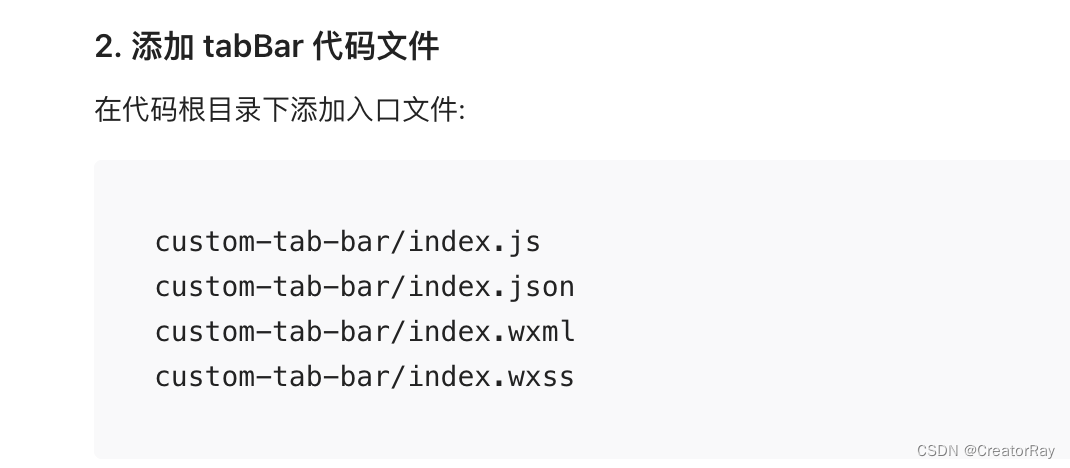
这个文件夹的名字也比较讲究,根据官方文件的提示,文件夹的名字要命名为custom-tab-bar,如果不写这个名字,还要去改配置。
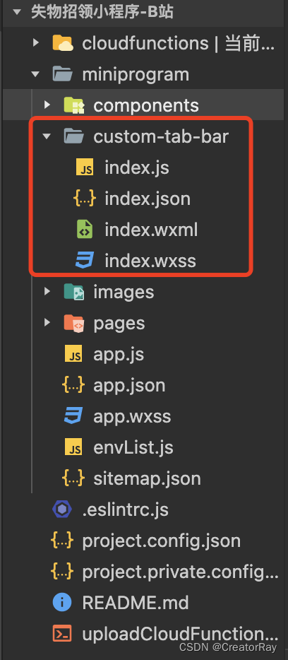
然后就可以去写这个组件的内容了,按照你自己的需求,进行js、wxml、wxss的内容编写,和普通组件就没什么区别了。
custom-tab-bar/index.js
js">Component({
    data: {
        select: 0,
        list: [
            {
               iconPath: "/images/index.png",
               pagePath: "/pages/index/index",
               selectedIconPath: "/images/index_fill.png",
               text: "首页",
               type: 0
            },
            {
               iconPath: "/images/classify.png",
               pagePath: "/pages/classify/classify",
               selectedIconPath: "/images/classify_fill.png",
               text: "分类",
               type: 0
           },
           {
               type: 1,
           },
           {
              iconPath: "/images/collection.png",
              pagePath: "/pages/collection/collection",
              selectedIconPath: "/images/collection_fill.png",
              text: "收藏夹",
              type: 0,
           },
           {
              iconPath: "/images/me.png",
              pagePath: "/pages/me/me",
              selectedIconPath: "/images/me_fill.png",
              text: "我的",
              type: 0
           }
        ]
    },

    methods: {
        selectPage(e) {
            const { index, page, type } = e.currentTarget.dataset;
            if (index !== this.data.select && type === 0) {
                wx.switchTab({
                  url: page,
                })
            }
        }
    }
})
custom-tab-bar/index.json
js">{
    "component": true
}
custom-tab-bar/index.wxml
js"><view class="tabbar">
    <view
        class="tabbar-item {{ select === index ? 'tabbar-select' : '' }}" wx:for="{{ list }}"
        wx:key="index"
        data-page="{{ item.pagePath }}"
        data-index="{{ item.index }}"
        data-type="{{ item.type }}"
        bindtap="selectPage"
    >
        <block wx:if="{{ item.type === 0 }}">
            <image src="{{ select === index ?  item.selectedIconPath : item.iconPath }}"></image>
            <text>{{ item.text }}</text>
        </block>
        <block wx:else>
            <view class="publish">
            <image src="../images/add.png"></image>
            </view>
        </block>
    </view>
</view>
custom-tab-bar/index.wxss
css">.tabbar {
    width: 100%;
    display: flex;
    background-color: #fff;
    position: fixed;
    bottom: 0;
    padding-bottom: env(safe-area-inset-bottom);
    padding-top: 10rpx;
    z-index: 9999;
}

.tabbar-item {
    flex: 1;
    display: flex;
    flex-direction: column;
    justify-content: center;
    align-items: center;
}

.tabbar-item image {
    width: 50rpx;
    height: 50rpx;
}

.tabbar-item text {
    font-size: 26rpx;
    margin-top: 10rpx;
}

.tabbar-item .publish {
    width: 65rpx;
    height: 65rpx;
    background-color: #ff90ba;
    border-radius: 50%;
    display: flex;
    align-items: center;
    justify-content: center;
    margin-bottom: auto;
}

.tabbar-select {
    color: #ff90ba;
}
需要注意几点就是:
index.json里要设置component为trueindex.js里的内容格式与常规的组件一样- 因为是自定义组件,要注意的是,在写组件最外层的标签样式时,如果不写
padding-bottom,tabBar的大部分内容会被手机的底部遮挡住。
那么问题就来了,这个padding-bottom写多少合适呢,因为不同手机、不同终端这个底部遮挡区域都是不一样的。小程序>微信小程序为我们内置了这个值,env(safe-area-inset-bottom),将padding-bottom设置为这个值,它就会根据终端动态的计算一个合理的值。
这样就很好了。
切换tabBar的选中态
然后还剩最后一个步骤,就是在跳转其它tabBar页面的时候,选中态的切换,因为我们在组件内声明了select变量,其实动态的改这个值就可以。
但是不能直接在组件内进行更改,要在跳转页面的过程中进行更改。
比如select默认是0,代表A页面,当我们从A页面跳转到B页面的时候,我们就需要将select赋值为1,当然这也不是绝对的,这要取决于你组件内选中态的切换逻辑是怎么样的。
比如我的:
js">       list: [
            {
               iconPath: "/images/index.png",
               pagePath: "/pages/index/index",
               selectedIconPath: "/images/index_fill.png",
               text: "首页",
               type: 0
            },
            {
               iconPath: "/images/classify.png",
               pagePath: "/pages/classify/classify",
               selectedIconPath: "/images/classify_fill.png",
               text: "分类",
               type: 0
           },
           {
               type: 1,
           },
           {
              iconPath: "/images/collection.png",
              pagePath: "/pages/collection/collection",
              selectedIconPath: "/images/collection_fill.png",
              text: "收藏夹",
              type: 0,
           },
           {
              iconPath: "/images/me.png",
              pagePath: "/pages/me/me",
              selectedIconPath: "/images/me_fill.png",
              text: "我的",
              type: 0
           }
        ]
我这样来声明的话,select和页面的对应关系就是:
select: 0 = index页面
select: 1 = classify页面
select: 3 = collection页面
select: 4 = me页面
那么问题就来了,我如何在页面切换的时候,改自己这个自定义tabBar内的值呢。
系统为我们提供了getTabBar方法,你输出一下this,就可以看到这个方法,这个方法会返回给我们自定义tabBar的组件实例,也就是说,可以这样写:
js">	this.getTabBar().setData({
		select: xxx
	})
有了这个方法之后,我们在所有tabBar涉及到的页面的onShow方法里,进行执行上述代码即可。
比如在首页的index.js里:
js">  onShow: function () {
    if (typeof this.getTabBar === 'function' && this.getTabBar()) {
        this.getTabBar().setData({
            select: 0
        })
    }
  },
进行if判断的原因是进行兼容,避免报错。在getTabBar这个方法存在的前提下,再进行操作。
在分类页的index.js里:
js">  onShow: function () {
    if (typeof this.getTabBar === 'function' && this.getTabBar()) {
        this.getTabBar().setData({
            select: 1
        })
    }
  },
至此,我们就完成了,自定义tabBar底部导航栏的全部内容,大致分为三步:在app.json里进行tabBar的配置、编写组件内容、通过getTabBar方法切换选中态。
工种号:Code程序人生